#dads_hack
Brand Design
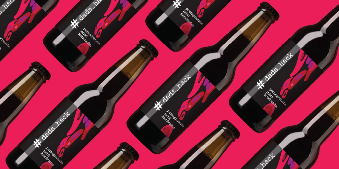
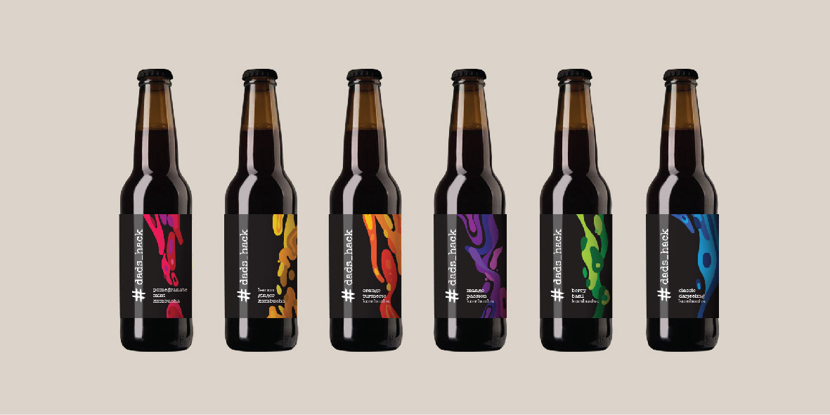
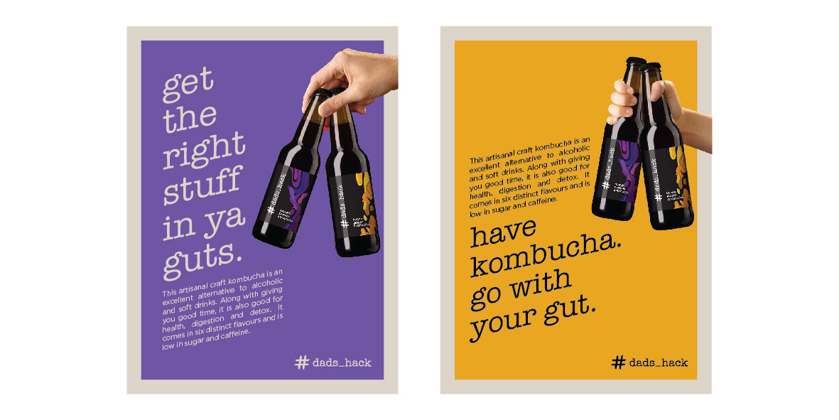
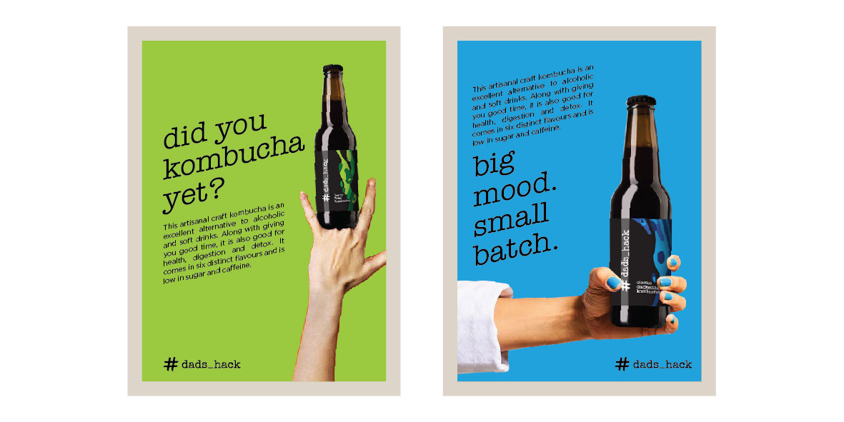
A kombucha brand born during the lockdown, aiming to improve the gut health. An excellent alternative to alcoholic and soft drinks especially when chilling with friends. Along with giving you good time, it is also good for health, digestion and detox. As the brand name suggests, everything about the brand right from creation to building a consumer brand are the result of a series of hacks. Moving from a small kitchen to a commercial scale involves multiple hacks too! The brand language is honest and fun. The brand colour is black with a dose of colourful scoby.
The original packaging that had the brand values of being simple, minimal and predominantly black, needed a do over!
The new design langugae was inspired by the live culture inside the bottle. The Scoby!
